
There’s an area in the business of Graphic Design and branding we feel doesn’t get touched upon much. You, the designer, have created a very nice branding and identity system and sit down with your client to hand them the keys to their shiny new “Porsche”. You shake hands and your client hits the road with the best of intentions…
Down the road, you find yourself looking the other way as they drive by with all sorts of “marketing” pieces they’ve created themselves, you know: brochures, flyers and other specialty items. They’ve randomly painted that Porsche with pink polka dots (Comic Sans vanity plate too)! This could be an error on the designer’s part — not defining proper graphic standards—or perhaps the client just didn’t know the value of brand consistency. Our focus today is not the case.

Pennie Carroll is a long time client of Farmboy, having worked closely with us for many years. She saw that even though she was a realtor under a large corporate umbrella, she had the ability to market herself and her associates with her own branding that we helped craft. Now when you see an ad on the side of a bus or in the latest copy of Iowa Living Magazine, you don’t see a realtor from a big corporate entity, you see the individual: Pennie Carroll & Associates or more importantly, Pennie herself. She’s done a wonderful job of strongly adhering to her brand by being consistent and marketing effectively.
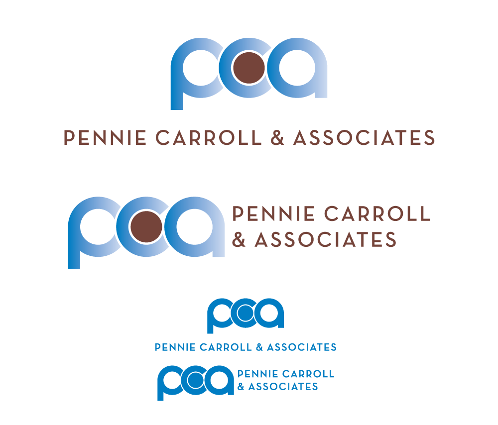
The logo and its variant orientation have her trademark blue, that is used on every piece of collateral.
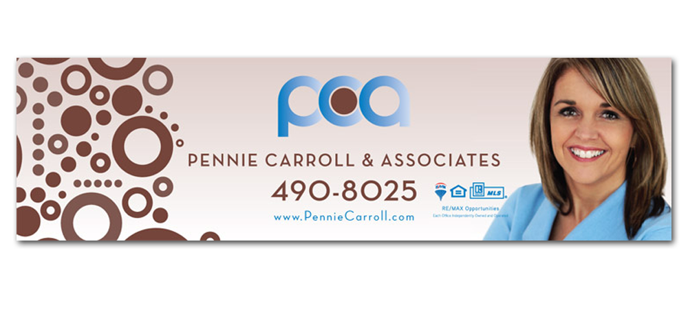
Stemming from the logo, we’ve created a graphic standard of fonts, colors, photography, and design elements that will carry to various forms of mediums. Like the bus bench above, or the custom graphic below…

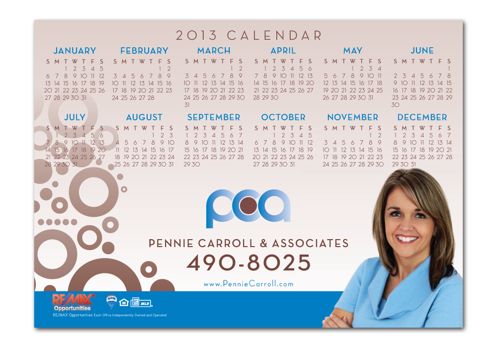
Which in turn can be placed into other pieces of collateral, effectively extending the brand’s reach!

Almost all of effective marketing is understanding your audience, and being clever about targeting their needs. Clients out looking for houses in West Des Moines? They’ll need a calendar, so why not a magnet they can put right on their fridge that they see everyday? Smart thinking!
Those are a few examples of simply being smart and consistent with your brand. Pennie Carroll & Associates took the keys and have gotten great mileage out of this simple but overlooked mindset. Even when running special promotions where they wanted to create something unique, it’s still possible to stay consistent while we’re bending the rules.
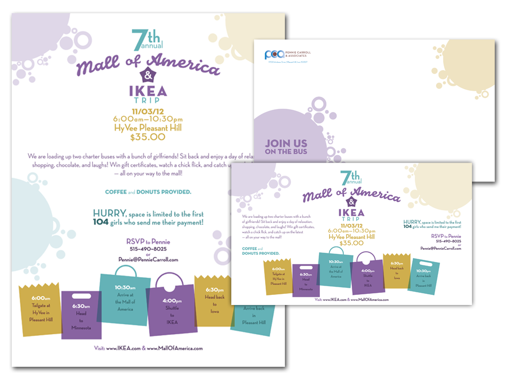 Here’s a good example of bending the rules, but still staying within the parameters of the brand. Same fonts and graphic elements (circles), but with a splash of new colors to create a fun direct mail piece for a special event.


Leave a Reply