So for todays lesson the hard way, I’ll share my little “aha” moment while trying to create an email through the MailChimp (awesome service) template maker.
Using their easy drag and drop editor really is, well, easy. However there are a few minor things you should watch out for, ESPECIALLY when you’re sending an email campaign to hundreds of potential customers. Error right in the header? Goodbye credibility!
The issue that left me in a mental pickle for a solid 20 minutes was simply putting the Farmboy logo into the header of our email. Simple right? Oh to be naive… To be ABSOLUTELY safe, we chose to use JPEGs instead of PNGs for all graphics placed, just in case some email platforms are buggy and don’t render them. Looking at you Outlook.
This is what it looks like when you’re editing:

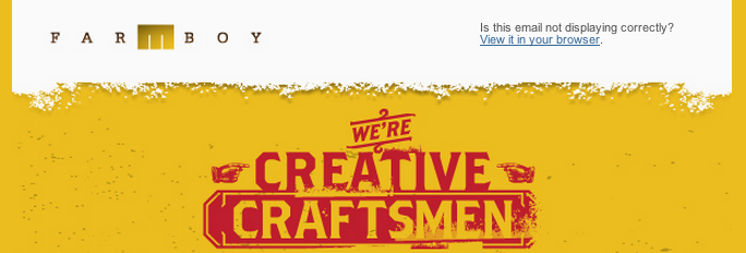
As you can see, everything looks solid. JPEG created from Illustrator and placed into the header left box. Hooray.
Sending a test email however, a little problem occurs:

Now I did adjust the curves of my screenshot in Photoshop to make the problem glaringly obvious, but you would have noticed it my designer friends. That background didn’t match my graphic!
Could be a quality issue while exporting from Illustrator, so I created a slice layer and saved for web (you really should just do it all the time). No dice.
Just for yucks I saved as PNG24 with no transparency. No luck again.
Okay, so no problem right? Just use that handy Inspect Element Chrome Extension (if you don’t know about it, message me, it’s amazing) to find out what that color is. Well kids, I did, and it’s #FAFAFA (Hex) which is not pure white. Feeling pleased with my discovery:
- I made this slight color change in Illustrator
- Saved for web
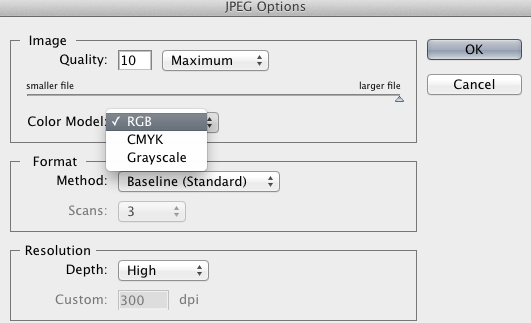
- Made sure it was RGB and NOT CMYK
And? Still that darn box. I grew agitated…

Was left with no other choice, I had to ask boss man to take a stab at it. It took him a bit too, but he did figure out the issue, and that lies in Illustrator.
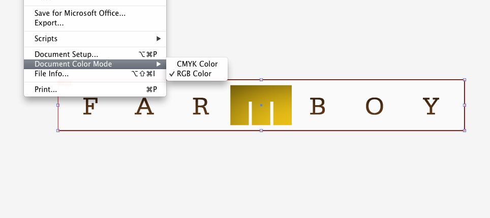
Were you familiar with Document Color Mode in Illustrator? Clearly I wasn’t, and in there was the issue.
Located under File>Document Color Mode, you’ll see you have two options: CMYK and RGB.

You see, Illustrator by default typically sets up a document for CMYK mode, which is intended for PRINTED works. The HEX color will shift slightly even if you had entered the exact formula before saving your image for web. Therefore doing an export or save for web and toggling in this dialogue box…
 Won’t do a dang thing UNLESS you change the document color mode so it’s set for working in RGB mode, i.e. working for web! Otherwise you’re just wasting your time and will have a serious case of “Clint Scowl”.

So as you can see, we’ve perfectly matched our JPEG export to MailChimps off white header background. We now can rest assured our logo will be visible across all email platforms, and it won‘t appear all caddywhompus (look it up) and scare away potential clients who worry we can’t even get an email right.
That’s all for yours truly today. Another lesson learned by a Graphic Designer who was schooled in print, and learning new Web Design tricks everyday. I hope to keep sharing my findings so other designers can learn with me, or laugh at my rookie mistakes. Either way I aim to please.
Zachary Kern is the left handed right hand man at Farmboy Inc. A student of Grand View University in Des Moines and a perennial design student for life.

Leave a Reply
You must be logged in to post a comment.