A few months back we began work handling brand consulting and WordPress web development for Cryo Life, a sub-brand under Zimmerman Chiropractic in West Des Moines, Iowa. Zimmerman was adding cryotherapy to their long list of wellness services and wanted to give Cryo Life an identity all its own.
First off, how does cryotherapy work you might ask? Well you know I had to try it myself.
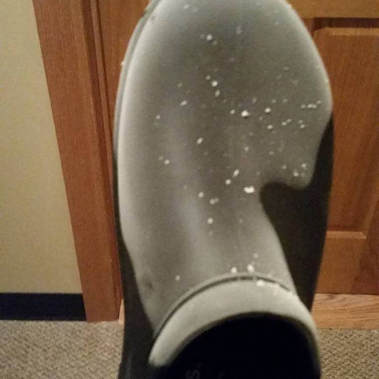
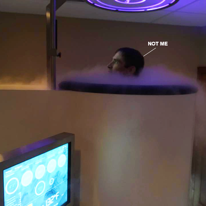
You shed all clothes save for your unmentionables and socks. You’re then given some highly fashionable slippers and a robe and an attendant has you step into the CryoCabin (which I can best describe as looking like an open-top vertical tanning bed). They touch the screen, and before you know it the chamber is almost instantly hyper-cooled to -220ºF (-140ºC). You stay in for up to 3 minutes, and believe me that is enough. I was shaking more than a chihuahua with espresso.
Why do it? Well you’ve used an ice pack before yeah? Same deal. Cold Therapy has been around for a LONG time and this is just a logical next step. Check out their benefits page to read more about it yourself if I’ve piqued your interest. Or see it in action via video they have right on their site, starring Demi Moore no less.
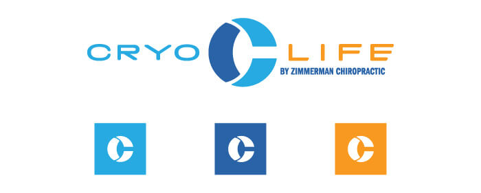
We began the branding process by helping the Zimmerman team land on a name for its service as well as making sure it was under their main brand, and thus Cryo Life (By Zimmerman Chiropractic) was born.
It was perhaps all too obvious that blue would play into the identity so it was important to work with a few shades as well as balance it all out with a warm color to keep our palette out of the Antarctic. This warm tone is often used to assist CTA’s (call to actions) jump off the page and screen.


We wanted to give them a fun “bumper sticker” slogan that could be used on promotions, collateral, and most likely some upcoming t-shirts. To further play up the sub zero elements we created a fun fractal pattern that we work into supporting assets as well as the website.
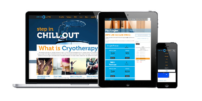
Speaking of the website, our web development team did a great job of making a deceptively simple custom website with some great features. It’s in WordPress of course. We love WordPress.
- Custom fields were implemented in many pages to allow the user to easily change and update content (such as package deals) without needing to pick up a phone to call us.
- Booking a session is handled right through the website via a Mind/Body portal.
- Medical History forms are made easy to download so you speed up your first visit.
- We worked very quickly. From start to finish (including branding) we launched the site in just under a month!
- And of course the whole thing is responsive so you can visit the site and book right off your tablet or phone.
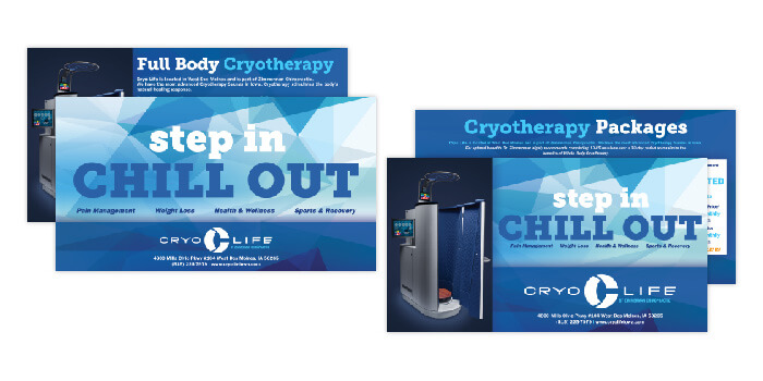
To help spread the word and flesh out the brand, we created all sorts of goodies such as MailChimp templates, promotional handouts (pictured above), social media ad graphics, and the standard stationary items that all businesses come to expect.
In the end it truly was a cool project to work on and we’re sure more is to come. In the meantime if you want see more of their branding or web development we worked on by following the corresponding links.
If you want to learn more about the Cryo Life business and maybe book a session for yourself, check out their website.
Thanks for reading!


Leave a Reply
You must be logged in to post a comment.